

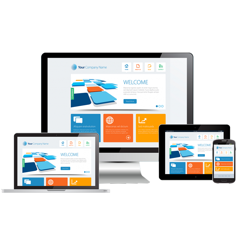
Responsive Website Development with Bootstrap
Bootstrap helps us design responsive, mobile-first websites with modern UI components. At Swastik Web Technology, we use its powerful grid system and pre-built components to develop faster while maintaining consistent and professional design across all pages.
Bootstrap Framework
Build responsive layouts quicklyGrid System
Flexible 12-column layout systemPrebuilt Components
Buttons, modals, cards & moreResponsive Design
Mobile-first & cross-device supportPowerful Features of Bootstrap Framework
Responsive Grid System
Bootstrap’s grid system allows us to create flexible and responsive layouts that work across all devices.
Prebuilt UI Components
Buttons, modals, cards and navigation elements help us build modern interfaces quickly and efficiently.
Clean & Structured Code
Bootstrap helps maintain clean and well-structured frontend code which makes projects easier to maintain.
Our Bootstrap Development Process
UI Planning
We plan the user interface and layout structure before starting development.
Bootstrap Development
Our developers build responsive layouts using Bootstrap’s grid and components.
Testing & Launch
We test the website across devices and browsers before launching it.